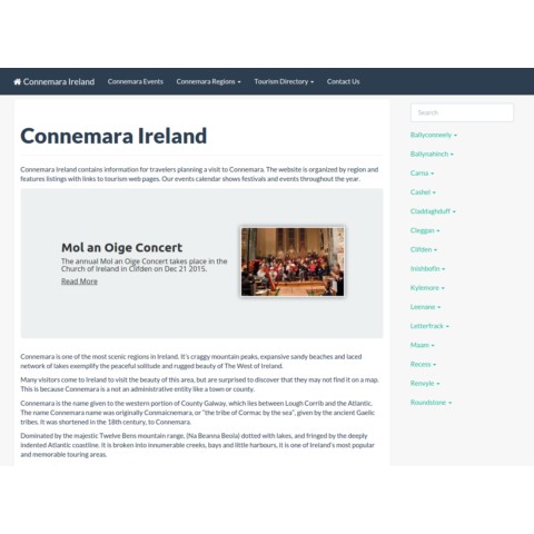
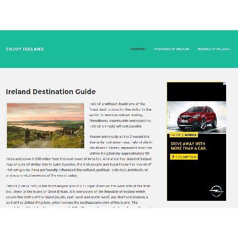
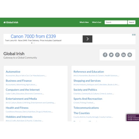
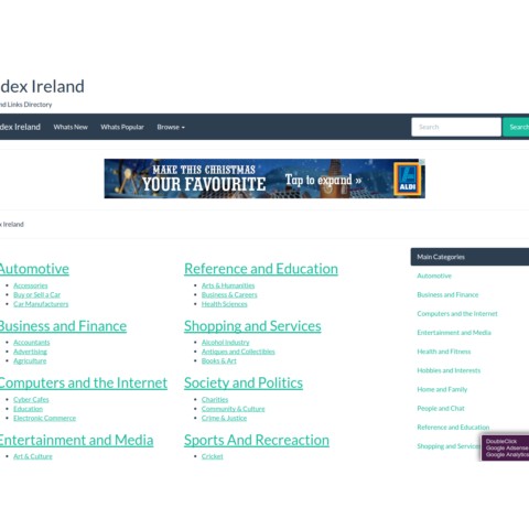
Making sure your website looks great and functions flawlessly whatever screen it’s accessed from is now absolutely essential – whether that’s a tablet, smartphone, iOS device or Android phone. One of the big benefits of responsive design is that the website is designed based on screen size, not device. This means that no matter what size screen someone is viewing your website, it will display properly for that screen size.
Having a mobile website is no longer simply a nice feature, it is now a necessity and literally impacts the growth of your business.
All work I do is focused around a user-centric approach, boosting customer engagement, lowering bounce rates and raising that conversion rate too.
Below are some samples of my work …..
Loading...

